The past week in the Middle East has been devastating. In fact, to describe it as devastating might be an understatement. The Israel-Palestine conflict has escalated in a way that we haven’t seen in a long time. I will refrain from delving further into an explanation of this conflict. There are other, better sources online about that written by people smarter than me. That being said, I have become increasingly interested in the hand the United States has played in this conflict.
To that end, I found a dataset of all U.S. Foreign Assistance dating back to 1946. I used this data to analyze the aid provided by the United States to Israel and Palestine, and found some interesting stuff. As usual, click below to jump around:
- Aid to Israel vs. Palestine
- Contextualizing the aid
- Who is dying here?
U.S. Aid to Israel and Palestine
I will start by showing how U.S. aid to these two entities has differed over the past ~15 years. (On your phone? Click here for an actually readable chart. I’m trying out some new visualization methods).
As you can see, this chart tells two stories. First: the U.S. gives a lot of aid to both countries, but aid to Israel dwarfs that received by Palestine. Since 2008, the U.S. has sent roughly 5x more aid to Israel than Palestine (an average of $3.4b/yr vs. $687m). Inversely, Palestinian casualties dwarf Israeli casualties in magnitude. During this time period, there have been 22x more Palestinian casualties than Israeli casualties.
I’ll pause here for some housekeeping items about the data:
- Casualty figures are obtained from the U.N. and are independently verified. Casualties are defined as fatalities or injuries.
- All monetary figures in this article are adjusted for inflation.
Okay, so we’ve determined that the U.S. sends a lot of foreign assistance to both Israel and Palestine, but considerably more to Israel. Let’s further contextualize this.
Contextualizing the Aid
Comparing to other countries
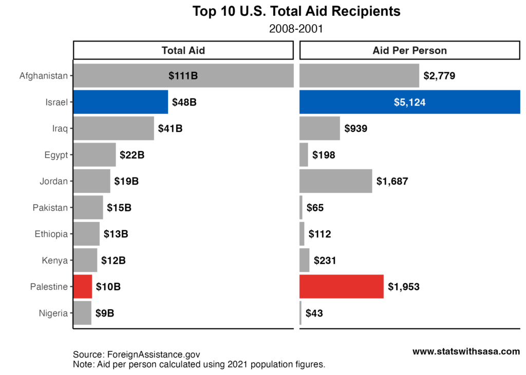
As we’ve established, the U.S. gives a lot of aid to both countries — Israel in particular. In fact, from 2008-2021, the $48b in aid that the United States gave to Israel was outclassed only by assistance provided to Afghanistan. Adjusting for population makes this comparison even more stark. The U.S. sent $5.1k worth of assistance per Israeli person during this time period. This is easily the most aid America sends per capita to any country in the world (excluding micro-nations like Micronesia). In comparison, Palestinians receive 62% less aid per person. The following chart shows how both countries rank among the Top 10 total U.S. aid recipients.
What kind of aid?
Not all aid is equal, of course. Some foreign assistance we send is in the form of Health aid to combat infectious diseases. Other assistance takes the form of Education aid to help bolster ill-equipped teaching facilities. The following chart breaks down the nature of the aid the U.S. sends to Israel and Palestine.
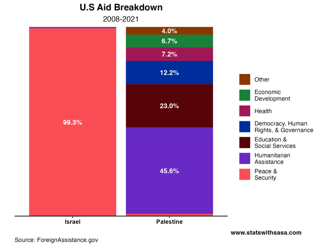
Again, the difference is incredibly stark. Basically all aid the U.S. provides to Israel is categorized as “Peace and Security.” Most of this assistance takes the forms of direct military aid. Meanwhile, the aid provided to Palestine is much more “humanitarian” in nature. Ultimately, this chart shouldn’t really surprise anyone. Israel is a highly developed nation with its own resources, and doesn’t need money for things like schools. The people of Palestine, on the other hand, are much worse off in comparison. Assistance to build schools is much more needed especially when some of the UN ones get shelled by IDF forces
Bonus Content: Who is dying here?
There has been a lot of rhetoric in the last few days about the “true victims” of the conflict. I feel that a lot of it has been disingenuous, and quite frankly wrong. So I am going to present a chart that contextualizes civilian vs. combatant deaths on each side from 2008 to 2022. I will stress that these numbers have been collected by the United Nations, which requires that each casualty be “validated by at least two independent and reliable sources.” I’ll present the chart without further comment (mobile users click here):
Concluding Thoughts
One thing that has been wildly notable recently is the massive level of misinformation running around. AI generated pictures are circulating the internet to incite outrage. For god’s sake, people are using video game footage to propagate fake information. Now more than ever, it’s so important to be vigilant about the information you consume. Our best weapon here is just plain critical thinking and common sense, because even trusted sources have implicit biases that we must be aware of. And no, my blog posts are certainly not immune. The whole point of implicit biases is that we don’t even really know when we have them.
More importantly, the past few days have been devastating for a lot of people. Many of our loved ones are hurting. It’s so important to be kind and have empathy in times like these. It’s easy to give into hate when atrocities like this occur, without even realizing it’s happening. On that note, it feels like (in America at least), the atmosphere in the past few days has been at an almost bloodlust. It is eerily reminiscent of the U.S. immediately after 9/11. That period is a time that a lot of Americans are ashamed of looking back. That was a time when I was cornered on the playground by a friend and asked if I was loyal to America. That was a time when innocent Sikh men were murdered on the streets for wearing a turban. I hope that things like this do not happen this time around, but I’m not wholly optimistic. The least we can do is look out for our neighbors and act with kindness.
Take care everyone, and thanks for reading.
I like to end my more serious articles with something more lighthearted. So here’s a song I’ve been vibing to recently.