A couple days ago, I came across an article from NCAA.com about the hometowns of the some 5,000 NCAA D1 Men’s Basketball players. The post had some interesting insights, but also had a number of flaws that I thought warranted a follow-up. For starters, the article’s “top states” for College Basketball (CBB) players include California, Texas, New York, and Florida in the top 5. Similarly, the “top cities” are led by NYC, Chicago, and Houston. Basically, a lot of takeaways from the article read like the infamous XKCD article about the abundance of geographic analyses that end up just being glorified population density maps.
Another less obvious, but still interesting, facet of this analysis is what exactly constitutes a “city.” For instance, consider David Mitchell and Aaron Cooley of the Brown Bears, who both list Roxbury, MA as their hometown. Anyone familiar with Boston would instantly take issue with an analysis that doesn’t count these two as coming from Boston when doing analysis of top cities for CBB players. After all, Roxbury is actually a neighborhood within Boston city limits. Similarly, for my Richmond area friends, Sophomore Guard Joe Bamisile of the GWU Colonials lists his hometown as Chesterfield, VA and went to high school less than 10 miles from the proper city limits. Bamisile should probably count towards Richmond’s statistics. The underlying data is rife with examples like this – where players list hometowns that are either within cities or culturally & economically part of the nearby major city.
To that end, I set out to augment this analysis in an attempt to get to the bottom of the question – where are NCAA CBB players coming from?
Data & Methodology
*No one will blame you for skipping this section
Since the NCAA.com article didn’t provide its underlying data, I set out to collect my own dataset for this analysis. I began by scraping data from CBSSports.com, which has exhaustive data on the rosters of all 358 D1 Men’s CBB programs in the United States. The CBSSports website was missing roster data for roughly 20 lesser-known teams, which left a dataset of 5,278 players – close to the 5,510 players analyzed in the original article. Furthermore, CBSSports was missing hometown data for roughly 10% of the players – a quick spot check revealed that these were almost all International players. Due to this data quirk and the following methodology, this analysis is limited to players from the United States.
After this data was collected, I began the deceptively difficult task of mapping listed player hometowns to a uniform concept of a “city.” To that end, I began with the concept of a “Core-based statistical area”, which is a US Census Bureau way to delineate metropolitan areas. Utilizing CBSAs had a number of advantages – since they are census units, it allowed for population data to be collected quickly and accurately, and it is a “standardized” concept of a city rather than leaving it up to the discretion of the individual players. The incredibly tricky part was mapping these CBSAs to the players’ listed hometowns. After all, there is no standardized mapping of all the towns and neighborhoods in the United States to their respective CBSAs. As a result, I scraped data from ProximityOne.com, which gave comprehensive data of all towns and cities of more than 10,000 people within each of the ~950 CBSAs in the United States. Here is an example of the data for the Washington-Arlington-Alexandria metro area. I then augmented this data with various Census datasets to fill in missing data.
Once this data was collected and formatted, I was able to map roughly ~80% of the players with non-missing hometown data to specific CBSAs. At the end of the day, I was left with a dataset of 3,730 players. Once the CBSAs of each player were identified, I was then able to easily merge population data to the surviving dataset. At that point, we could start playing with the data to derive some fun insights.
Results – so where do CBB players come from?
Top Cities by Raw # of Players
One of the first things we might be interested in is seeing how the more comprehensive CBSA methodology changes the results of the original article. While the original article only displays the “top 10” cities, the data from my analysis that I present shows results for all CBSAs with a population of more than 500,000. To contextualize this cutoff, the smallest Metropolitan Area that made this cutoff was Pensacola-Ferry Pass-Brent, FL.
Note that when comparing the two tables, the methodology of my analysis resulted in a dataset that was 70% smaller than the original analysis.
Original Results
Updated Results
Major movers due to the methodology update are Miami, Atlanta (+3), Dallas (+3), Philadelphia (-4), Baltimore (-6), and Memphis (-10). It does appear that utilizing a broader CBSA methodology rather than relying on listed player hometowns does have a significant effect on the results.
Top Cities Adjusted by Population
As noted in the beginning of this article, one of the additional dimensions of this analysis that we’re interested in is population-adjusted metrics. For example, the NYC Metro Area has ~15% more current CBB players than Atlanta – but it also has 3x the population. So is it appropriate to anoint NYC the CBB capital of the US when Atlanta is punching that much above its weight? The following table summarizes the number of CBB players per 100,000 people for each CBSA in an attempt to adjust for this:
The results are drastically different than the unadjusted numbers. The “megacities” do a lot more poorly – with NYC, Chicago, and LA dropping from 1st, 3rd, and 5th respectively all the way down to 68th, 30th, and 73rd. Instead, small Metro Areas of around ~1m people dominate (shout out out to RVA — which is very surprisingly top 10, despite the most notable NBA player from the area arguably being Jeremy Lamb who was drafted 9 years ago).
Top States
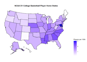
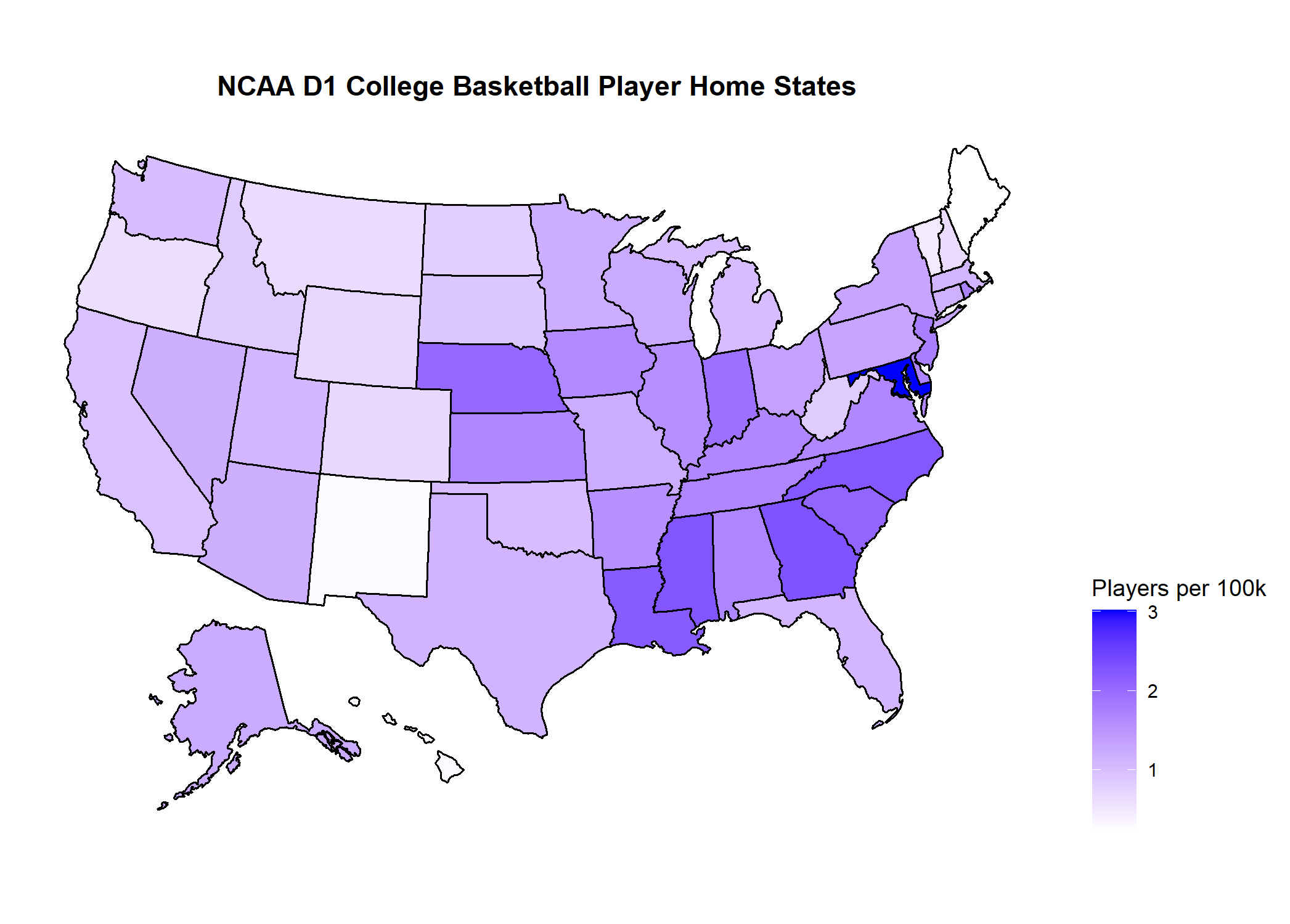
Instead of looking solely at CBSAs, we can also look at how entire states compare to each other. The advantage to this approach is that all players with non-missing hometown data list their home state, so we do not have to engage in any sort of mapping – which leads to additional missing data and can sometimes be imperfect. The results can be seen below:
A heatmap also helps visually illustrate how the states compare with each other. Interestingly, we can note that Maryland is such an outlier that it distorts the heatmap. This is actually a somewhat informative lesson about heatmaps and their sensitivity to outliers. Sometimes, it is okay (and even necessary) to omit outliers in order for the plot to be meaningful for all other observations. Below are heatmaps with and without data for Maryland:
-
- Click to enlarge
-

- Click to enlarge
Perhaps surprisingly, we see Maryland and Alabama in the top 5 of the adjusted metrics. California, which has the most number of current CBB players using raw #s is actually an abysmal 37th when adjusted to population.
Generally, another key takeaway from the all the results so far is that North Carolina is the Mecca of College Basketball. The state has the 4th most CBB players when adjusted for population, and Metro Areas that are at least partially located in North Carolina comprise an astounding 4 out of the top 10 population-adjusted Metro Areas for CBB talent. Moreover, 3 schools from North Carolina (UNC, Duke, and NC State) account for 14 NCAA championships since 1939, or almost 1 in 5 of all championships ever won. That compares to just 2 apiece for New York, Texas, and Florida, which together account for almost 22% of the nation’s population.
Regional Differences
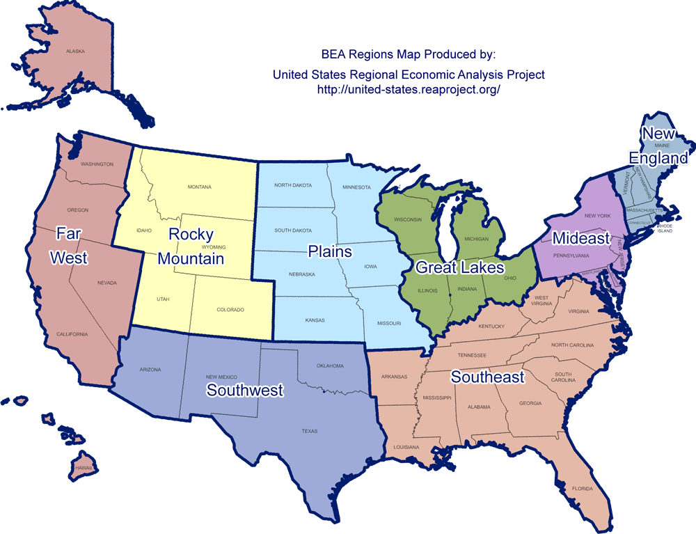
Another dimension of this analysis we might be interested in is regional differences across the United States. For example, it is relatively common knowledge that the Mid-Atlantic and South have an special affinity for college sports, while New England has been more or less apathetic towards them ever since the Ivy League became largely irrelevant (even though Penn’s arena – The Palestra – is the single most historic arena in college basketball and is often called the “Cathedral of College Basketball” due to the influence it’s had on the sport. In contrast, The Pitz at Brown looks like it should probably be an aquarium instead).
There are many ways to sort the US States into different regions, but one of the more intuitive ways that largely fits our narratives of American Regions is laid out by the Bureau of Economic Analysis. The BEA lays the US out into 8 regions: Far West, Great Lakes, Mideast, New England, Plains, Rocky Mountain, Southeast, and Southwest as such:

The results of the regional analysis can be found below:
One or more columns doesn't have a header. Please enter headers for all columns in order to proceed.
These results indicate that the American Regions can largely be sorted into 4 “tiers”, where the top 2 are above the National Average the bottom 2 are below:
- Tier 1: Southeast and Mideast
- Tier 2: Great Lakes and Plains
- Tier 3: Southwest, New England, Far West
- Tier 4: Rocky Mountain
Overall, these results are largely consistent with our priors on how different regions in America contribute to NCAA CBB talent.
Conclusions
Overall, this analysis is an interesting exercise in how methodology and approach can lead to drastically different conclusions in analytics, even when trying to answer the same question. I don’t think either approach discussed here is necessarily particularly “wrong”, however I also think its usually often important to properly contextualize analyses when utilizing “volume stats”. For example, what is more impressive – a Quarterback passing for 5,000 yards off 700 attempts, or a Quarterback passing for 4,500 yards off 550 attempts?
Oftentimes, it is usually the best approach to consider a “hybrid approach” that blends volume and efficiency together in a way that takes into account unusual efficiency that might result from small sample sizes. Consider the earlier Quarterback example – would we consider a Quarterback that throws for 500 yards off 50 attempts to be the “best”? After all he would have the highest yards per attempt of the group (10 vs. 8.2 vs. 7.1), but no serious analysis would conclude that he was the “best quarterback” given the data.
Similarly, my analysis in this article attempts to adopt a “hybrid approach” when ranking the top cities by introducing a “cutoff population” of 500,000 for the Metro Area to be considered in my analysis. Otherwise, you get outliers like Lawrence, KS and Sumter, SC having top ~5 players per capita – even though each city only has 5 active NCAA players apiece.
I hope you found this article interesting! Serious thanks to Andy Wittry, the author of the original NCAA.com analysis. This was a cool topic that I had a lot of fun tackling, and his post inspired me heavily.
As always, if you want more content like this, please consider SUBSCRIBING BELOW. I promise I’ll only email with updates on new posts. In fact, I’ll probably forget to even do that: